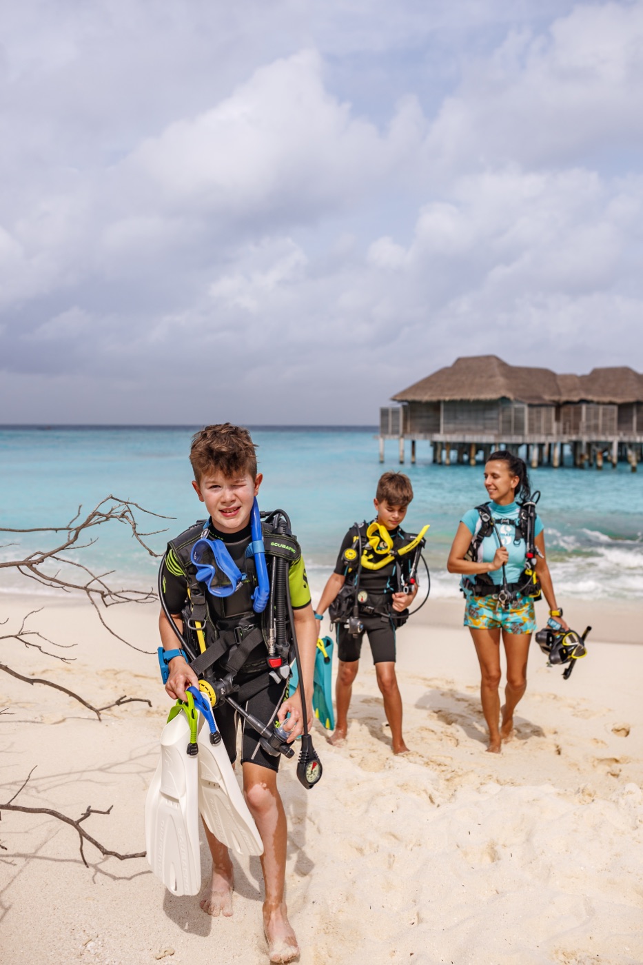
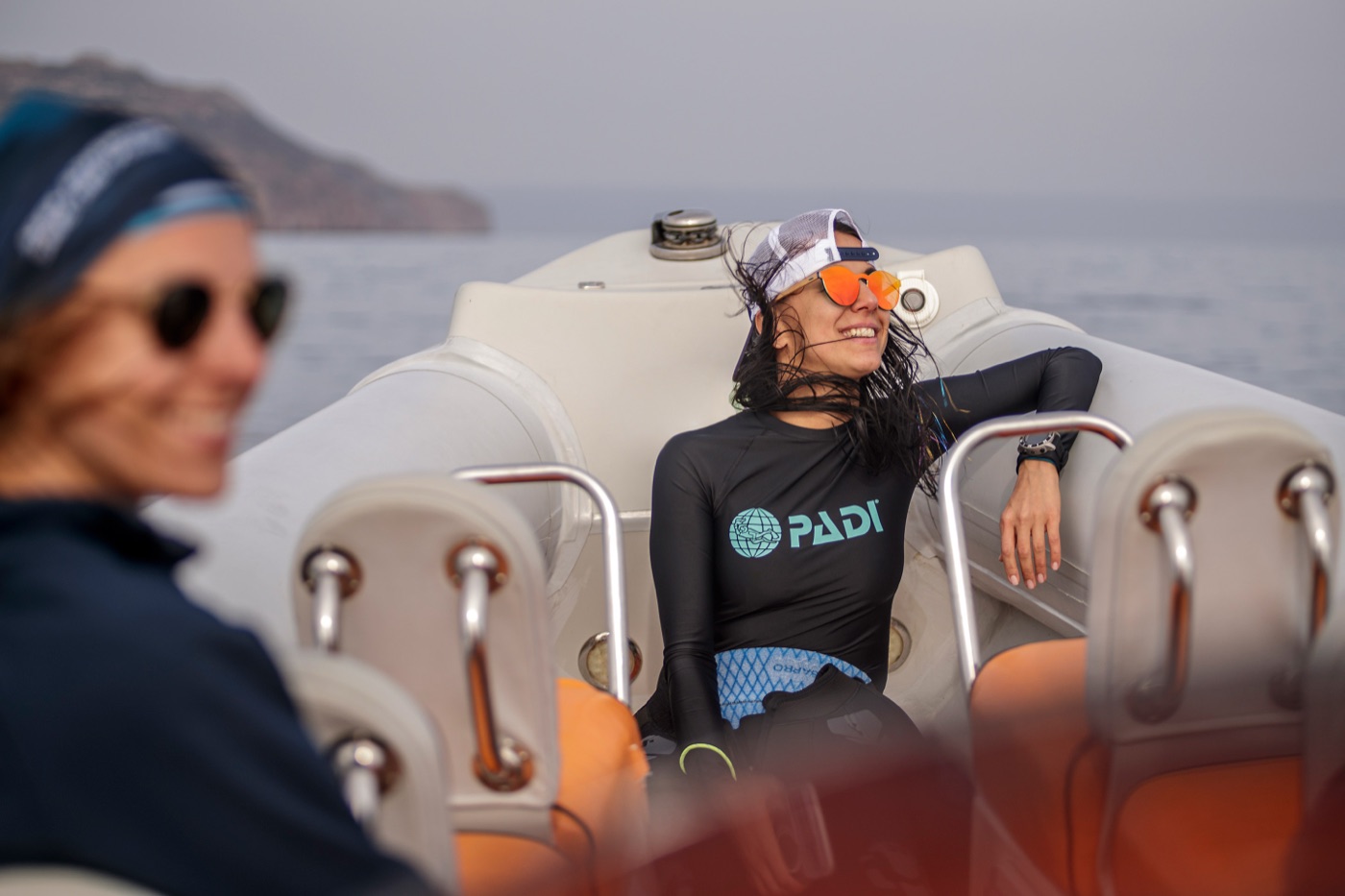
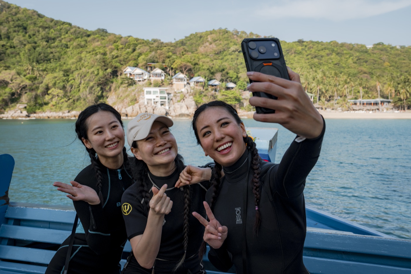
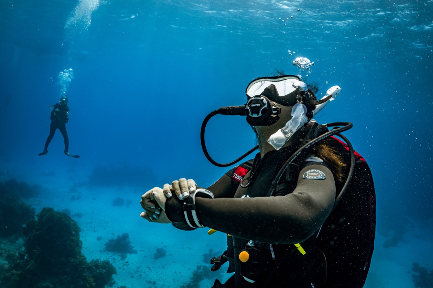
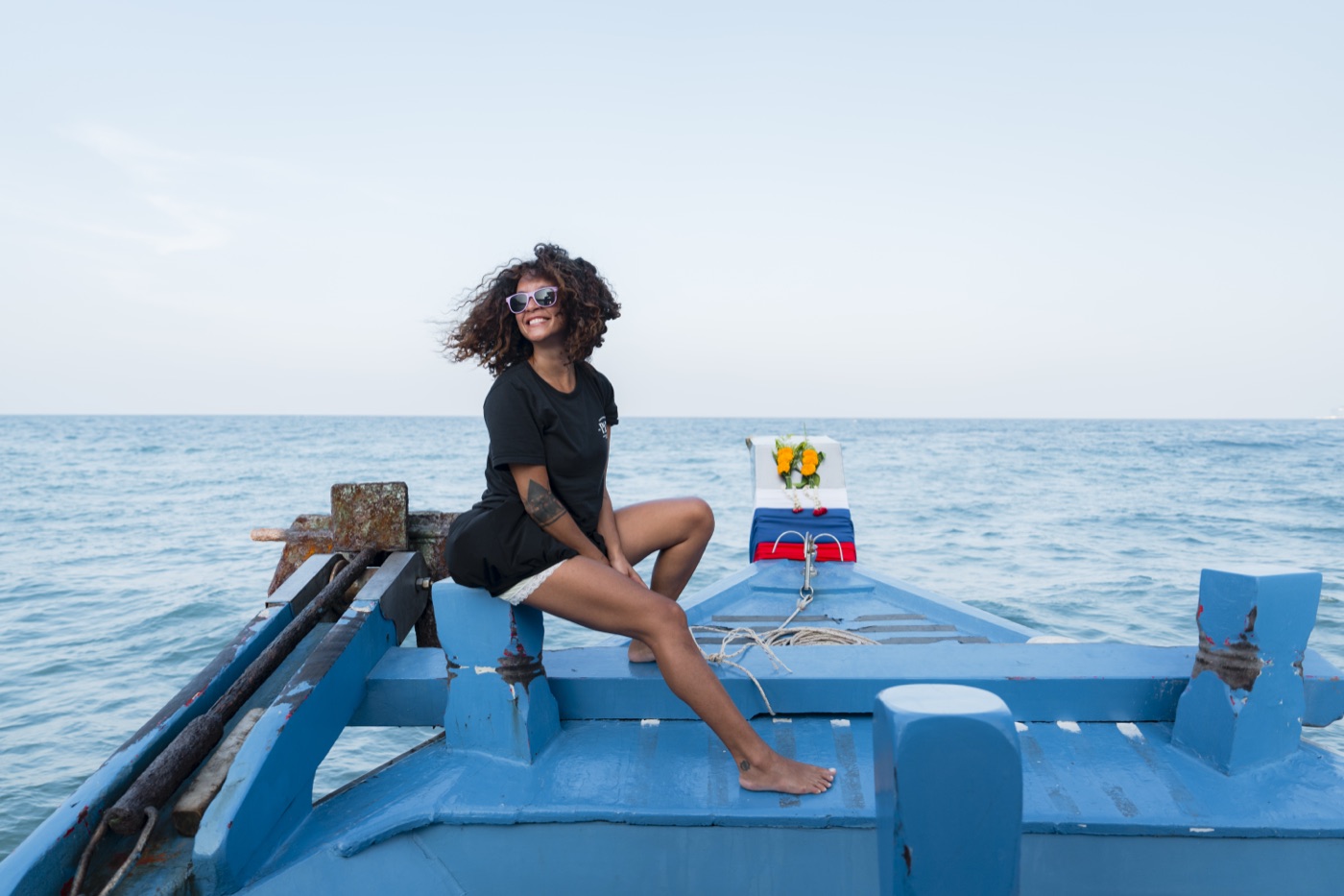
A working set of reusable ways to frame PADI photography across the product. Every pattern combines three ingredients — a photo from the brand libraries, a PADI shape device, and a guideline-driven treatment — so imagery reads as “one PADI” in every hero, card and banner. Rendered on real brand images.
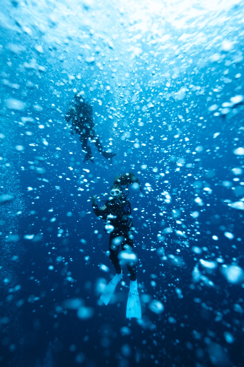
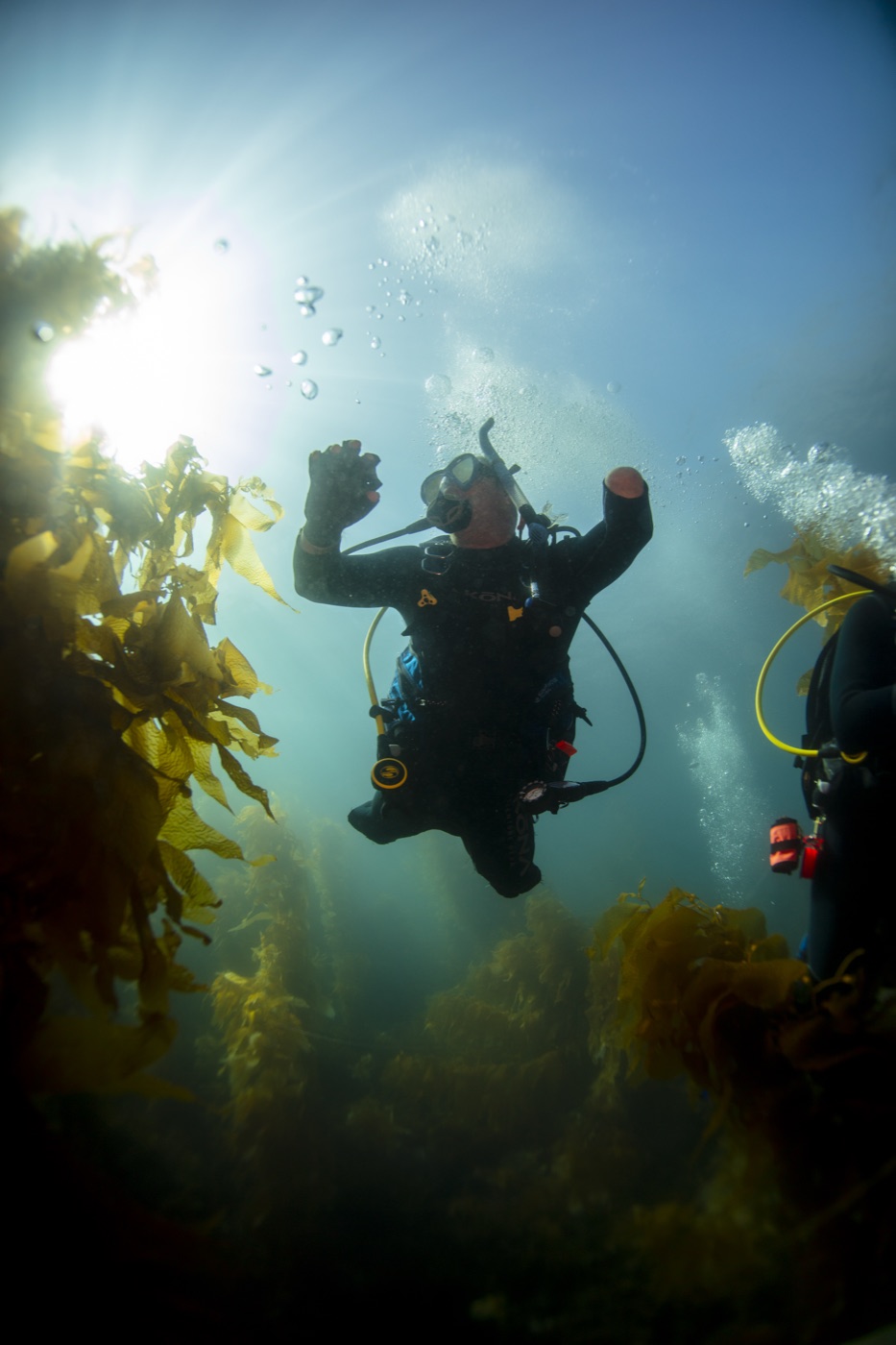
The core overlay: an airy surface fading to a deep-navy floor. Keeps the bright top of the shot untouched and only darkens where headline and CTA land.
Imagery · up-shot / anyShape · gradient veil
Use in
HeroMedia cardCTA bandSheet header
Lens flexTeal-navy veil (First Breath) → dense navy (Immersion).
AccessibilityMeasure text contrast on the scrimmed pixels — body ≥ 4.5:1, display ≥ 3:1.
Surface
TopsidePlan the trip
BelowExplore the reef
02
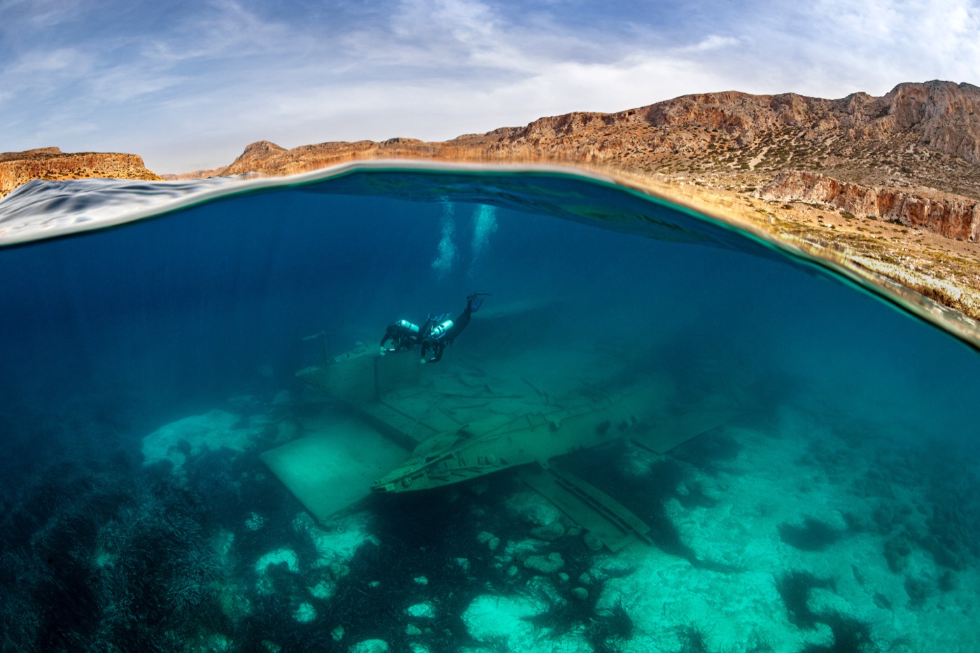
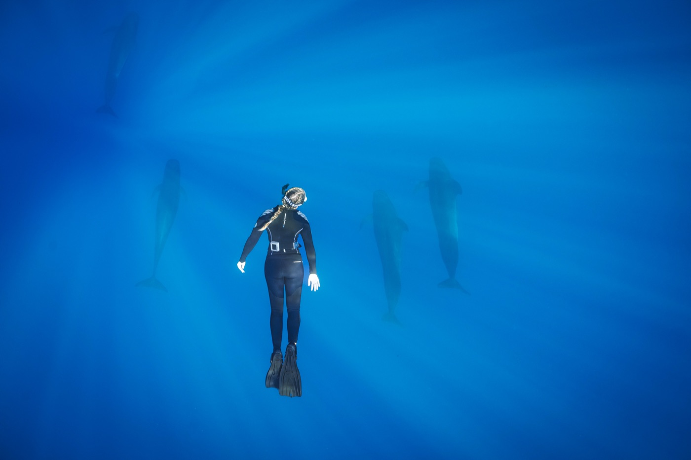
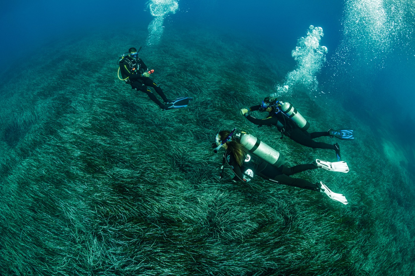
Split-Water Band
Use the brand’s over/under shots so the water-line itself becomes the divider between two content zones — anticipation above, adventure below. A signature PADI moment.
MotionBubbles may drift upward on scroll; freeze under prefers-reduced-motion.
Light & colour treatments
how the image is graded
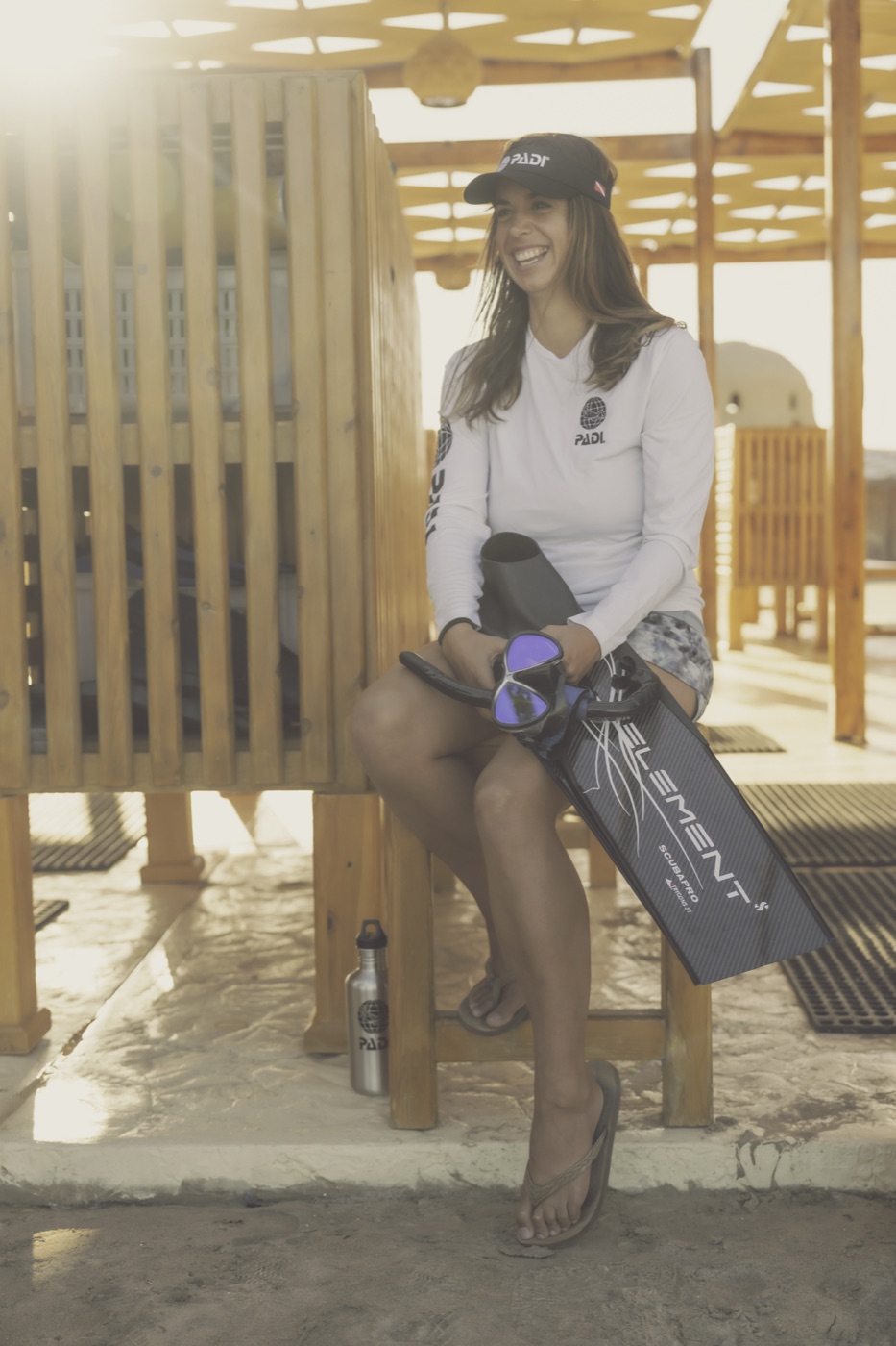
Positive
Use light to keep it light.
07
Sunray Bloom
A soft radial light-bloom and faint ray streaks from the surface, blending the shot into a natural glow. Adds lift without faking light on the subject.
The intent (borrowed from mature brand systems like Energy Safety Canada, not their shapes): stop dropping photos into plain rectangles — frame them inside your own iconography, break the rectangle, and fuse photo + brand colour + a repeating motif. Below, that intent is expressed through PADI’s globe, waves, bubbles, sonar ripples, depth contours and reef cells.
Light & motion
Sunlight, sliced.
12
Light-Shaft Slices
The photo is fractured into staggered vertical columns with bright gaps — reading as shafts of surface light — and a single Caribbean bar is set among them.
Concentric rings radiate from a focal subject — bubbles, sonar, reach — with one Caribbean ring as the accent. A repeatable motif that also works as pure texture.
Imagery · single diver / focalShape · concentric rings
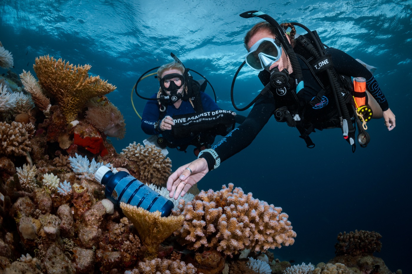
Bathymetric contour lines from a nautical chart drape over the photo, with a Caribbean isobath and a depth scale — data made beautiful; strong for conservation & training.
Photos tile into a honeycomb of hexagonal cells — a coral-colony cluster — with a couple of cells held as solid brand-colour accents. Celebrates breadth and conservation.
ESC intent → PADIFragment the photo into brand-shaped tiles (their blades → PADI’s reef cells).
Use in
CommunityAbout / missionConservation grid
Dive centres6,600+in 180+ countries & territories
17
Tidal Band
A bold PADI colour band where a wave-cut photo panel flows into the fill and Caribbean “current” streaks sweep across a headline stat — high-impact for proof & CTAs.
ESC intent → PADITheir colour band + masked figure + diagonal streaks → PADI colour band + wave-cut panel + current lines.
Use in
Stat / proof bandCTA bandClub / membership
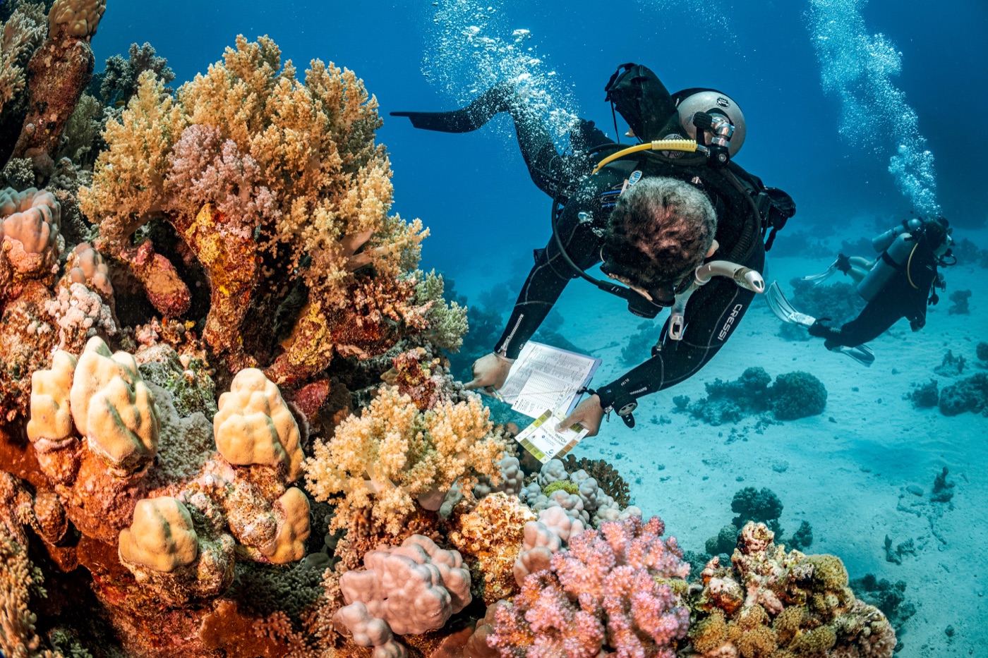
Utility imagery
small & recognisable
AvatarPorthole · 1:1 · ring
Avatarreal diver, centred
Thumbnail1:1 · radius/md
Thumbnaillist / result row
Muted thumbduotone · ambient
How to read this board. Each pattern is a reusable recipe = photo × shape × treatment, rendered on real PADI brand imagery. Ratios, radii, scrims and elevation map to the tokens already in the Visual Language Directive; the “Lens flex” line shows how each adapts across Immersion · First Breath · Currents · Momentum. Guardrails from Brand Guidelines §5 hold throughout: natural light, authentic moments, passive marine interaction, regulated symbology never restyled, and never information-by-image-alone.